
The 2026 color forecasts started rolling out last fall, and we pay closer attention to them than most contractors probably do. Not because we chase trends. Because every winter, somebody calls us about a color they fell in love with online, we brush a sample square onto their wall, and the light in their Framingham living room turns it into something else entirely.
New England light is its own thing. Our winter days are short. A lot of the housing stock around here is older, built with smaller windows and more north-facing rooms than anything going up today. That gorgeous warm shade from the photo shoot? By 4 p.m. in December it can look like wet cardboard.
So take every trend list with a grain of salt, including this one. What follows are the five 2026 directions we actually believe in, and the ones we’ve already watched work in real homes in Ashland, Wellesley, Weston, and the towns around them. If there’s a through line, it’s warmth. Gray had a long run. It’s over.
1. Rich Browns Are Officially Back (Meet the Color of the Year)
Benjamin Moore went brown this year. Silhouette AF-655, their 2026 Color of the Year, is a deep espresso with charcoal running underneath it, and the company says the inspiration was classic tailored suiting. Fair enough. It does look like a very good suit.
Before anyone panics: nobody is bringing back the orange-brown Tuscan kitchens of 2004. Today’s browns live in a different lane. Mushroom. Cocoa. Warm taupe. Espresso. They read calm and a little expensive, the way a leather chair reads expensive.
One honest warning from our painters before you buy a gallon of Silhouette. This color is dark. Genuinely dark. It soaks up light instead of bouncing it back, which is the entire appeal, and also the entire risk. Give it a den, a dining room, a primary bedroom, a wall of built-ins, and pair it with a warm white trim like White Dove or Swiss Coffee, and it looks sophisticated. Put it in a dim north-facing hallway and you’ve painted a cave.
Dark paint also has zero patience for bad prep. Older plaster walls, and this area is full of them, need real surface work before a color this deep goes on, or every ripple and old patch will announce itself the moment the paint dries. If you’re picturing an espresso-brown room and wondering whether your space can pull it off, reach out to Ulta Home for a consultation. We’ll stand in the room with you, look at the light and the walls and the trim, and tell you straight.

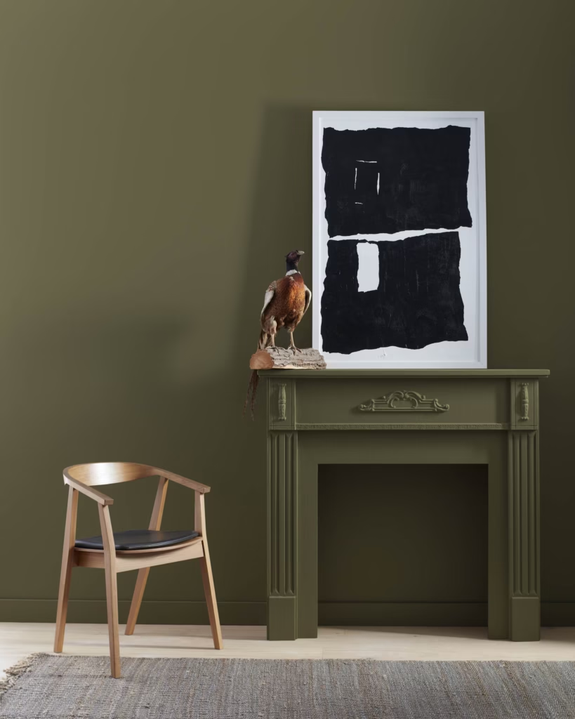
2. Earthy Greens Go Deeper
Green has been climbing for a few years now and it hasn’t slowed down. What’s shifting is the shade. The soft sage that was everywhere recently is giving way to richer, more grounded tones: olive, moss, forest, smoky jade.
It makes sense that this family does well around here. These are the colors of a New England backyard. And they happen to pair beautifully with the materials MetroWest homes already have:
- White oak and older amber-toned hardwood floors
- Walnut and other natural wood furniture
- Stone countertops
- Brass and aged bronze hardware
Green cabinetry deserves its own mention because it’s become one of our most requested kitchen updates. An olive or moss island against creamy white walls is a combination we expect to paint many, many times in 2026.
Where to use it: living rooms, home offices, dining rooms, kitchen cabinets. The deeper olives behave like the browns in trend one, so give them defined spaces and good prep.
3. Creamy Whites Replace Bright White
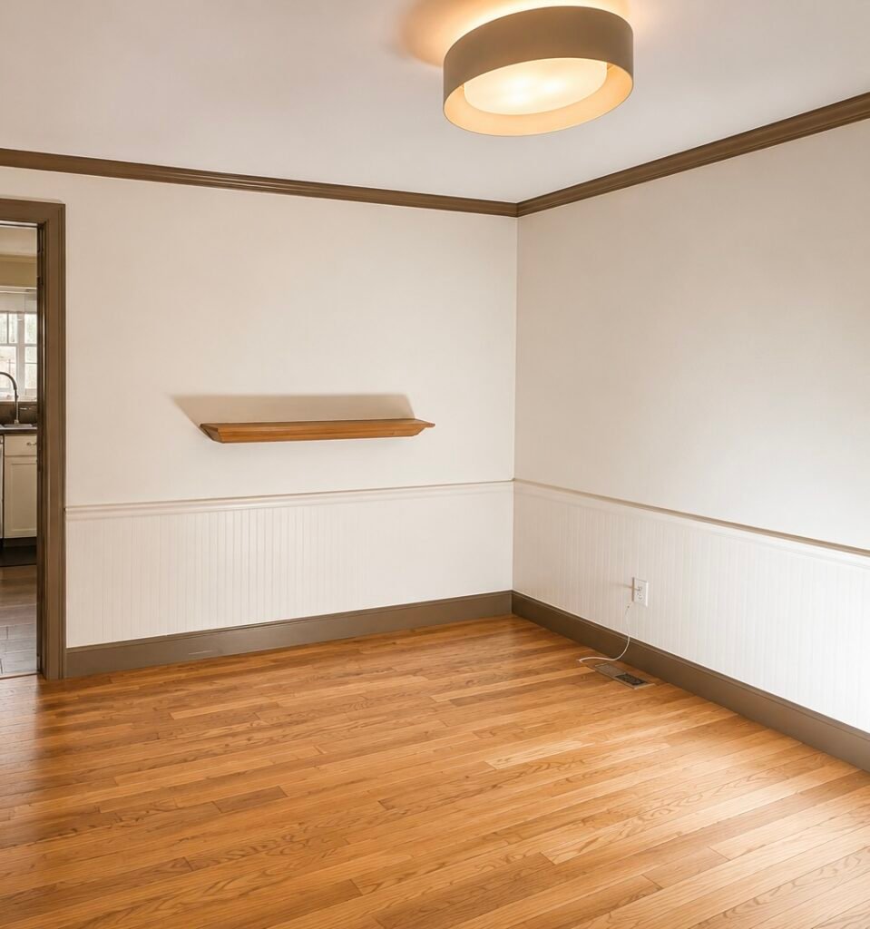
White isn’t going anywhere. The crisp, blue-leaning whites of the past decade are what’s fading, replaced by softer versions: cream, linen, ivory, alabaster, warm off-whites.
On a paint chip the difference looks like nothing. On a full wall it’s dramatic. Stark white can feel clinical in a New England winter, while a creamy white keeps the room bright without the chill. Warm whites also happen to be the natural partner for everything else on this list. They soften the deep browns and greens instead of picking a fight with them.
Where to use it: ceilings, trim, kitchens, and any room that faces north or gets limited direct sun. It’s also what we recommend next to older, amber-toned hardwood almost every time, because a cool white against warm oak floors tends to clash rather than flatter.
4. Clay and Terracotta Accents
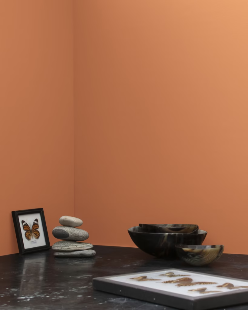
Warm, sun-baked tones borrowed from Mediterranean homes are showing up in New England, and honestly, they translate better than you’d expect. Clay, terracotta, rust, cinnamon, burnt sienna.
The key word is accents. These colors almost never take over a whole home. They show up in powder rooms, dining rooms, a fireplace wall, an entryway niche, one statement wall in an otherwise neutral room. Small doses, big personality.
Our take: a terracotta powder room might be the single highest-impact, lowest-commitment paint project on this entire list. One small room. A day or two of work for our crew. And every guest who walks in comments on it.
5. Color Drenching Continues
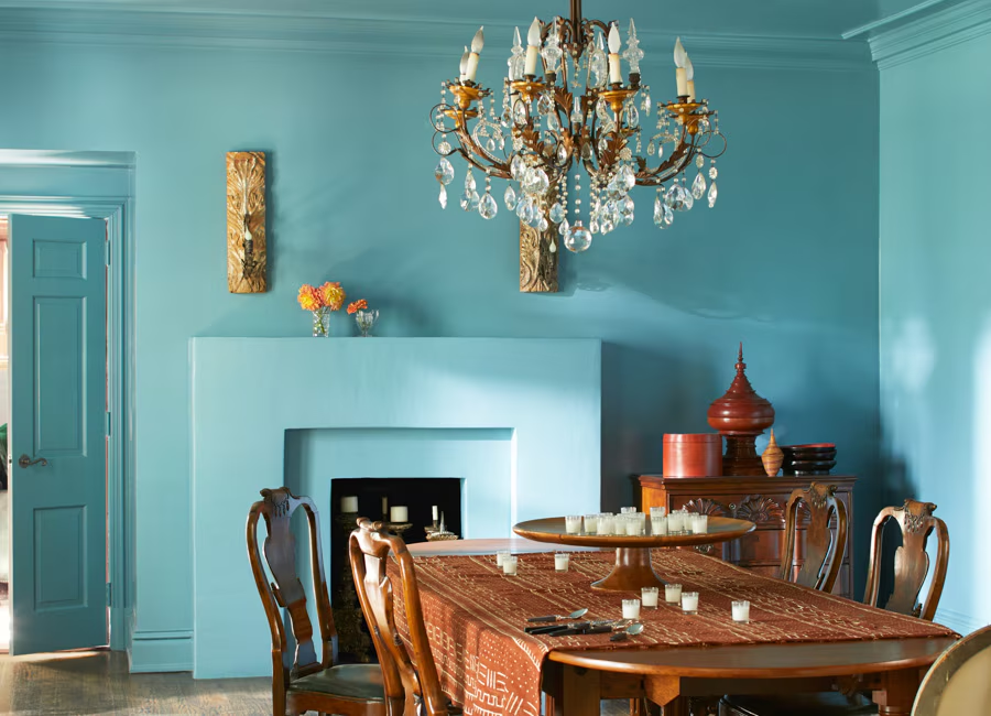
The boldest trend here, and the one we field the most questions about. Color drenching means painting the walls, trim, doors, and usually the ceiling all in one color. The major paint brands keep featuring it in their 2026 collections for a simple reason. Done well, it’s stunning.
A drenched room feels intentional and cocooning, and often reads larger than it is, because there are no contrast lines chopping the space up. It works especially well with this year’s palette (olive, mushroom, warm brown, charcoal) and in rooms that were never going to be bright anyway. Dens. Powder rooms. Primary bedrooms. That awkward small office.
Done poorly, it looks like someone ran out of trim paint.
The execution is where drenching lives or dies. We typically run an eggshell or matte finish on the walls, satin on the trim and doors, and flat on the ceiling, all in the same color. That sheen variation is what gives the room depth instead of flatness, and it’s the part DIY attempts miss most often. If you want to drench a room, this is the one project on this list where we’d genuinely push you toward a pro. It’s also a project our team loves taking on, partly because the results photograph so well.
What’s on Its Way Out
Just as useful as knowing what’s in. Cool gray walls, stark bright white everywhere, and high-contrast black-and-white interiors are all fading. We can vouch for this one from the field: our crews have repainted a lot of gray rooms over the past two years, and almost nobody goes back. Once homeowners live with a warm palette through a full New England winter, they get it.
If your home is still wall-to-wall builder gray, no need to repaint everything at once. Start with the room where you spend your evenings. That’s where the difference between a cool gray and a warm neutral shows up first, usually right around the time the sun sets at 4:30.
Thinking About a Refresh Before the Holidays?
A quick word on timing, because it matters more than people think. Interior painting season in Greater Boston picks up fast once the weather turns, and our fall calendar fills a little earlier every year. Start in August or September and your rooms are done, aired out, and put back together well before anyone shows up for Thanksgiving.
If one of these trends has been living rent-free in your head, whether that’s an espresso dining room, an olive kitchen island, or finally saying goodbye to the gray, let’s talk it through. Ulta Home handles everything from single accent walls to whole-home repaints across the MetroWest area, and a consultation costs you nothing but a conversation.
Ready to see one of these colors on your own walls? Contact Ulta Home today to schedule your interior painting consultation, and we’ll find the shade that works in your light, in your home, in this corner of New England.